I’m excited to share that I finished up my Purple Palm piece!
I took it off to the framer just the other day. Initially, I was pretty positive that I wanted to have it matted and framed white on white. I thought that that would provide a really clean look on which to have the stitching displayed.
But then I got there and started playing around with different mattes and frames, and (to my disappointment) I found that it looked much to stark. The colors were already so bright that when they were surrounded with white, they almost looked neon. (NOT a look I was going for!)
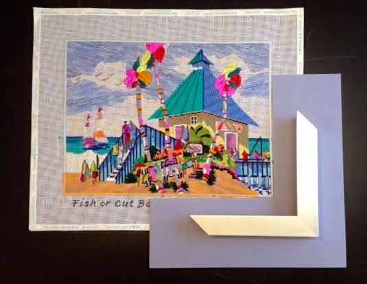
I ended up deciding on this pale purple matte and a white frame. I thought it really brought out the colors in the sky and warmed up the entire piece.
I guess the lesson to be learned here is that you never know until you try!
I can hardly wait to see it all finished up in the New Year!